sandbox
The “Sandbox” space makes available a number of resources that utilize and explore the data underlying "Secrets of Craft and Nature in Renaissance France. A Digital Critical Edition and English Translation of BnF Ms. Fr. 640" created by the Making and Knowing Project at Columbia University.
My work at the Making and Knowing Project
Roni Kaufman, Ecole Polytechnique
March 30, 2020 - July 31, 2020
I would like to express my deepest gratitude to all the Project
members that I had the chance to work with, Pamela H. Smith, Naomi
Rosenkranz, Terry Catapano, Dana Chaillard, Matthew Kumar, Gregory
Schare, Clément Godbarge and Tianna Helena Uchacz. I truly thank you
for working with me, for your constructive criticism and for trusting me.
All my work can be found here:
https://github.com/cu-mkp/manuscript-object/tree/v1.0-ronikaufman (originally, this was found on the branch context of my fork of the
GitHub repository manuscript-object).
My first task consisted in extracting the context from the text
tagged with the semantic tags. I used Python, and in particular the
third-party module lxml, to go through the XML manuscript1. For each
semantic tag (animal, body part, currency, environment, material,
medical, measurement, music, plant, place, personal name, profession,
sensory, tool, temporal, arms and armor) and each version of the
manuscript (TC, TCN and TL), I generated a CSV file, where the
columns are: “folio”, “text in tag”, “before” and “after”. The context is
inside “before” and “after”, written as Python arrays of (maximum) 10
words preceding and following the tagged text. The code to create or
update these tables is in the file context.py2. The CSV files are saved in
the directory context3 (which, like all directories named here, is created if
it doesn’t already exist when the script is executed).
Then, I began visualizing this extracted data. I used the third-party
Python module seaborn to create these, as well as all followings
visualizations. The script is in file context_viz.py4 and the images are
saved in the directory context_visualizations5.
For each version of the manuscript, I created a bar plot showing
the total number of different words in all the context arrays of each tag,
and a heatmap visualizing, out of these words, what size is the
intersection between every pair of tags. I later designed another
heatmap to see the inclusion of contexts instead of the intersection. This
second heatmap is referred to as “asymmetrical” in the file names (as
opposed to “symmetrical” for the first kind). I also designed a normalized
bar plot, in which the bar heights are divided by the total number of times
the tag appears in the manuscript. In these plots, we can notice how
similar or diversified is the author-practitionner’s vocabulary when talking
about different topics.
In order to understand the differences between the translations, I
generated new versions of all these visualizations. For the bar plots, the
three versions are grouped in one graph, and for the heatmaps, I simply
subtracted their matrices between versions to create new ones. They are
inside the subdirectory comparisons of context_visualizations6.
Towards the end of my internship, using this base of code, I also
generated all these heatmap plots for the words inside the tags, instead
of their contexts. These are saved in the manuscript_visualizations
directory7, because they do not regard the context but rather the whole
manuscript. Still, it is interesting to compare them with the context
heatmaps.
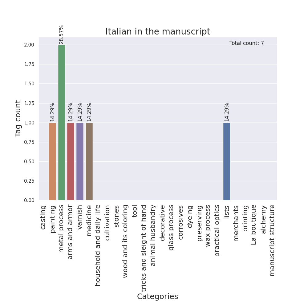
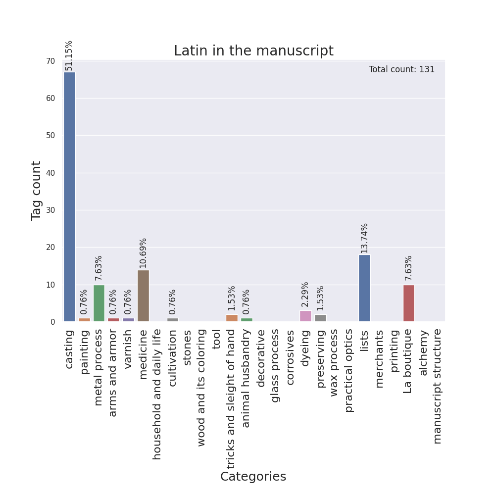
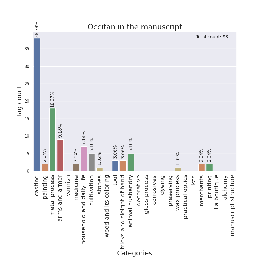
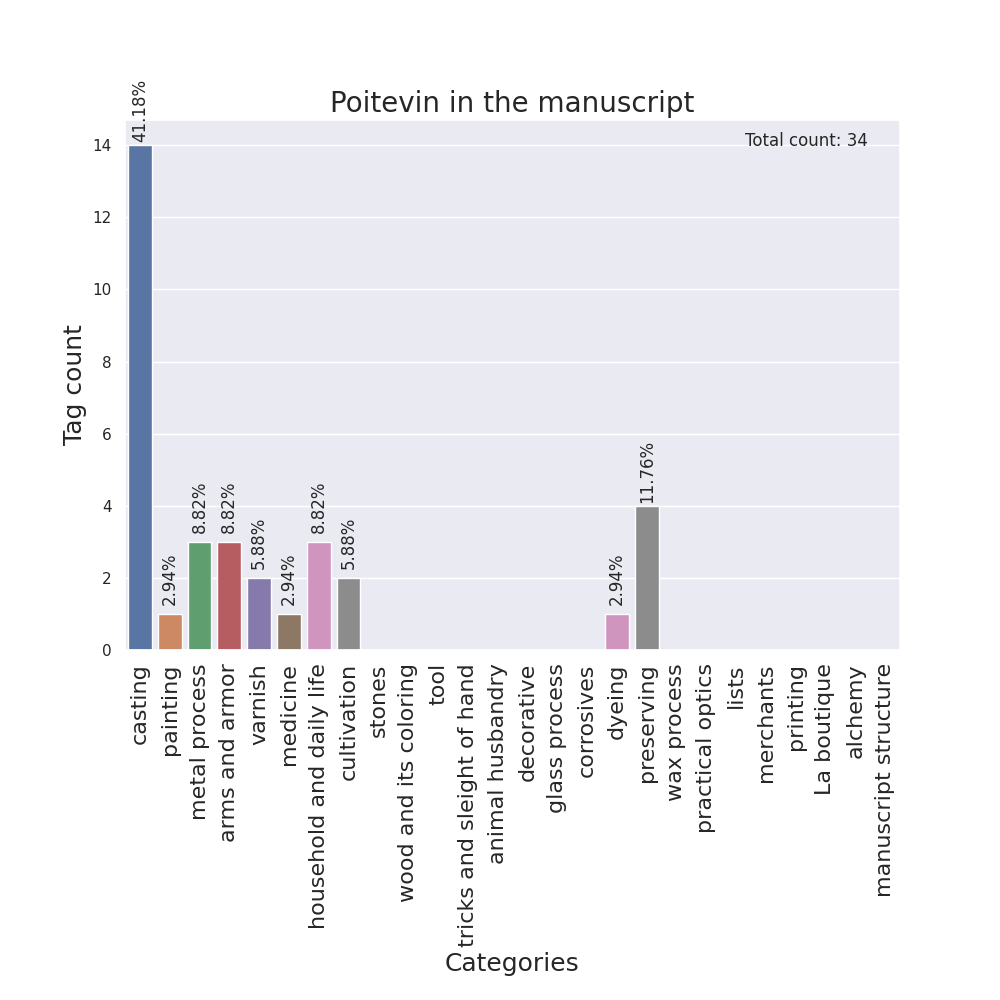
Following the observations of the differences between translations,
I was given the idea of visualizing other languages in the English version
throughout the manuscript. As this plot wasn’t related to the context, I
wrote the code in a new file, manuscript_visualizations.py, with in the
intention of adding in it the more visualizations later on. One execution
generates all the plots inside manuscript_visualizations8. As with the
context extraction, the data used is the XML versions of the manuscript.
I first tried making a scatter plot, with the folios in order on the
x-axis, the tag count on the y-axis and the language (French, Greek,
Italian, Latin, Occitan and Poitevin) as the color hue of the points. But
the plot was very hard to read, the data was too noisy. It was erased. In
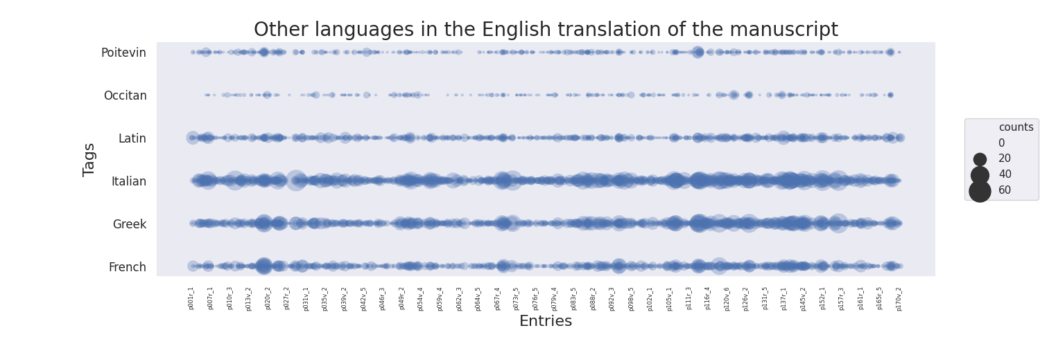
consequence, I tried visualizing this data as a bubble plot instead, with
one line per language, the entries on the x-axis (which is more relevant
than the folios) and the bubble size as the tag count, and the result was
much better.
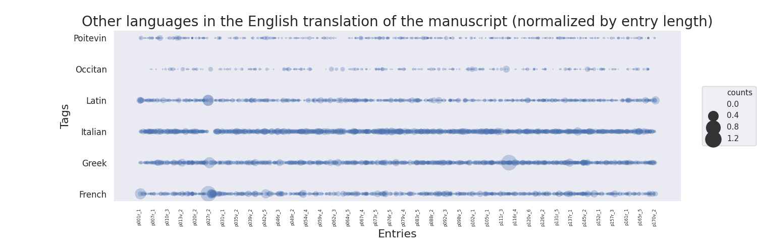
In a normalized version of this plot, I mapped the bubble size to the tag count divided by the total number of words of the entry.
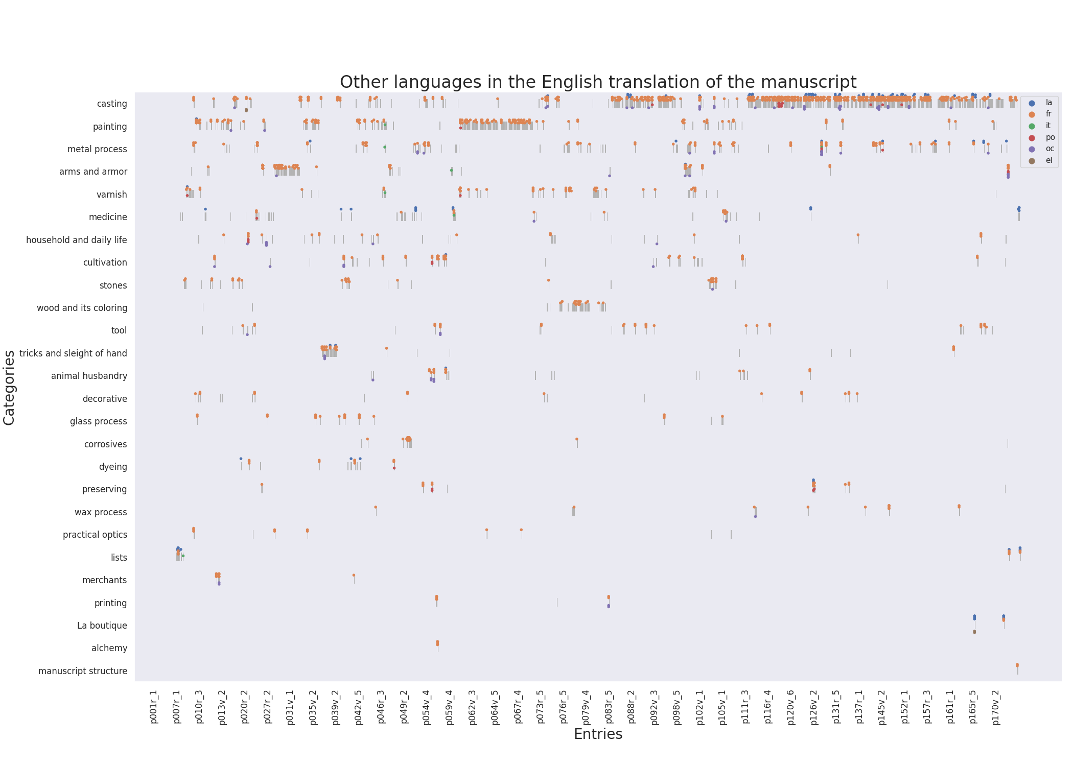
I also created a swarm plot to visualize this same data, with the entries on the x-axis, the categories on the y-axis and language as the color hue. On its background, all entries are drawn as lines, even if they don’t contain the tag of interest. This allows us to see, where there are no dots, whether it is because there are no entries with this tag or no entries in this category at this place in the manuscript.
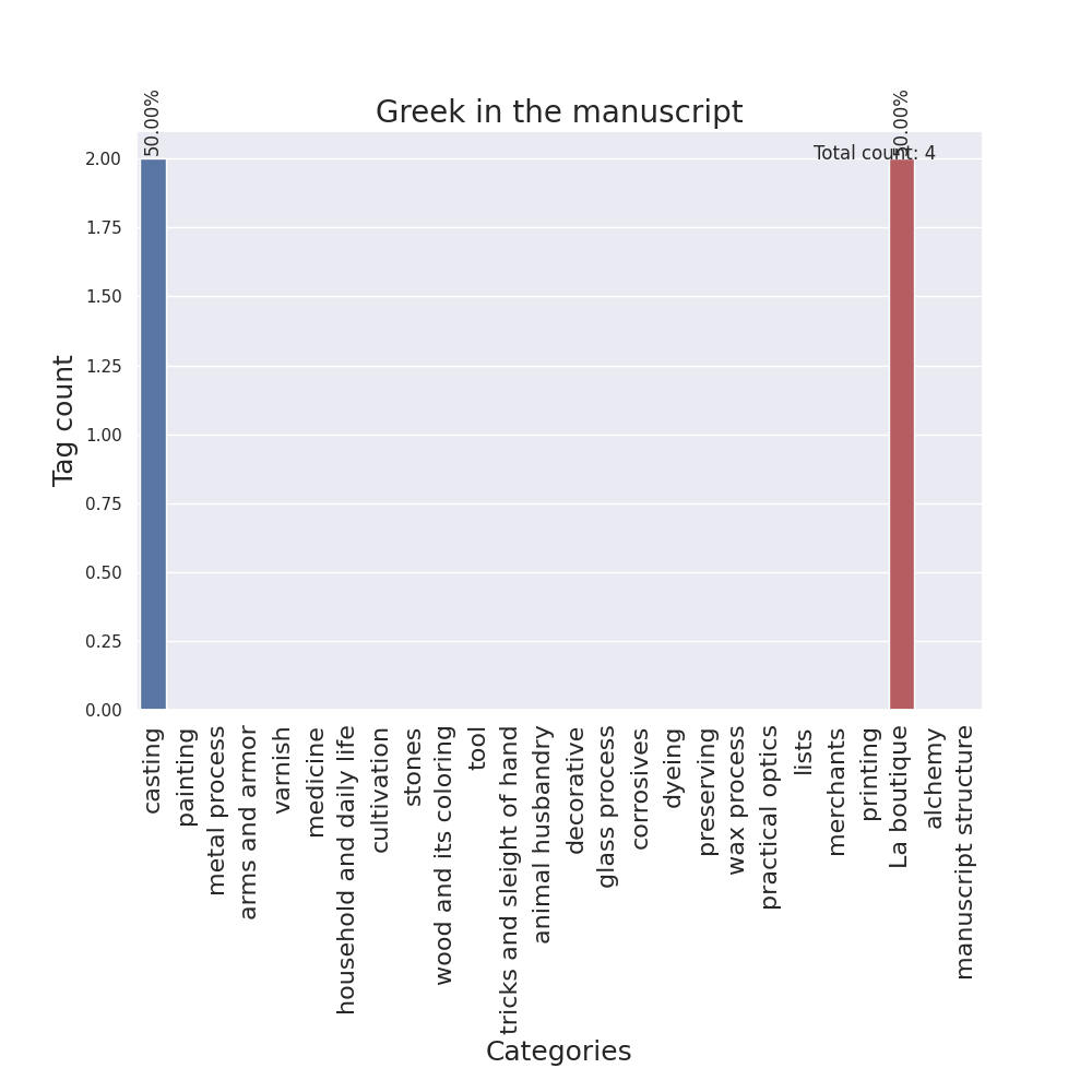
I designed barplots as well, with the categories on the x-axis and the tag counts on the y-axis, one for each language.
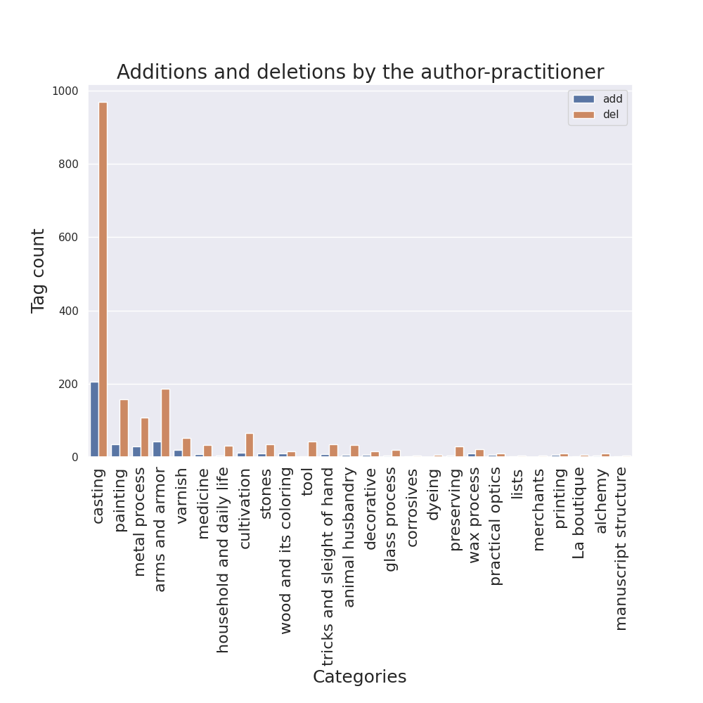
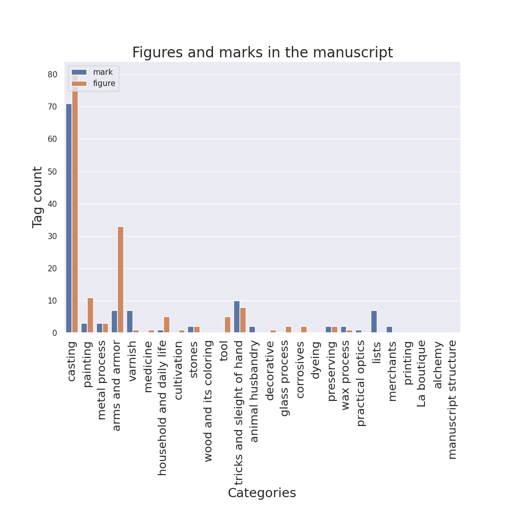
Then, I adapted these plots in order to make them easily created with different tags, and all code for the following visualizations was written with the same idea in mind. So, as other team members suggested, I generated them for additions and deletions, for margins, for semantic tags and for figures and insertions marks. For the cases of additions/deletions and figures/marks, a different bar plot groups various tags in separate columns inside the same image in order to compare them.
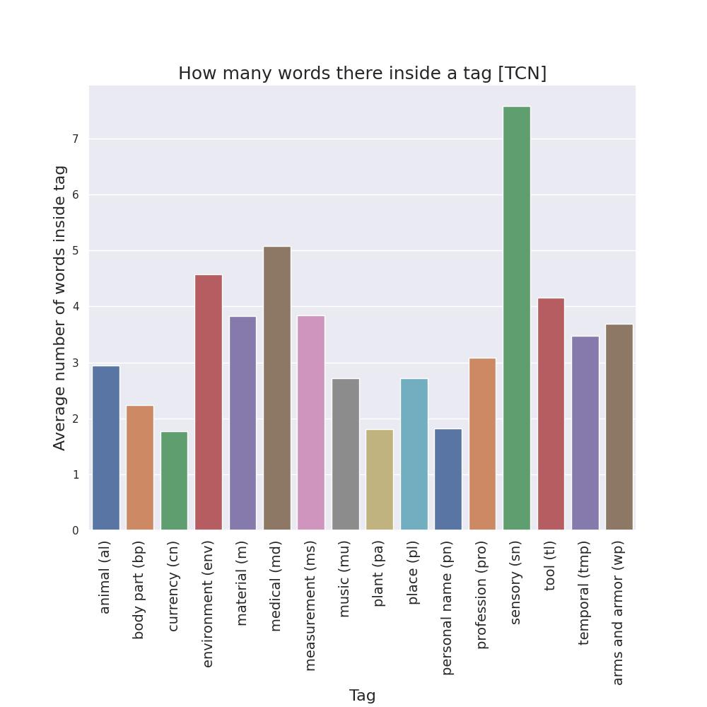
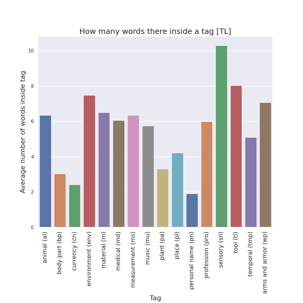
Finally, for the case of semantic tags, I also created bar plots to see, in each manuscript version, how many words there are in average inside the two tag bounds.

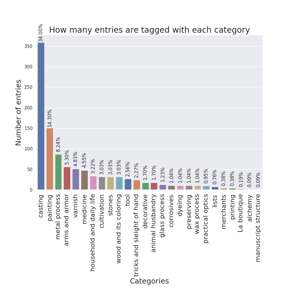
To visualize other properties of the manuscript not related to particular tags, I designed some more plots. One bar plot counts the number of entries tagged with each category.
For each version, a scatter plot9 represents all entries with the total number of words on the x-axis, the total number of different words in the y-axis, and the hue of the points as the folio number.
Finally, also for each version, yet another bar plot shows the total10 number of words and of different words using two different colors and transparency, to see how many entries there are inside different ranges of number of (different) words. A continuous density estimation is also added on top to see the general trend. These are called dist plots because seaborn, the Python module, calls them that way.
-
https://github.com/cu-mkp/m-k-manuscript-data/tree/master/ms-xml ↩
-
https://github.com/cu-mkp/manuscript-object/blob/v1.0-ronikaufman/context.py ↩
-
https://github.com/cu-mkp/manuscript-object/tree/v1.0-ronikaufman/context ↩
-
https://github.com/cu-mkp/manuscript-object/blob/v1.0-ronikaufman/context_viz.py ↩
-
https://github.com/cu-mkp/manuscript-object/tree/v1.0-ronikaufman/context_visualizations ↩
-
https://github.com/cu-mkp/manuscript-object/tree/v1.0-ronikaufman/context_visualizations/comparisons ↩
-
https://github.com/cu-mkp/manuscript-object/tree/v1.0-ronikaufman/manuscript_visualizations/heatmaps ↩
-
https://github.com/cu-mkp/manuscript-object/tree/v1.0-ronikaufman/manuscript_visualizations ↩
-
https://github.com/cu-mkp/manuscript-object/tree/v1.0-ronikaufman/manuscript_visualizations/scatterplots ↩
-
https://github.com/cu-mkp/manuscript-object/tree/v1.0-ronikaufman/manuscript_visualizations/distplots ↩